start to finish app build / iterative process / affinity digram / interactive prototypes / information architecture (IA)

Starting a business is a daunting, difficult process, and securing loans through traditional banks is time-consuming, arduous, and complicated.

GenEQTY is a neo banking app for women led Small to Medium businesses (SMBs). GenEQTY will help empower women to make smart business decisions and acquire loans/ avoid the traditional loan process which involves stress, patience, and often times denial due to a systemic gender biased system. Systematic bias influences women's opportunities to obtain funding, while factors like a lack of access to relevant business training and counseling may also affect the volume of applicants. While women own 30% of small businesses, they receive only 16% of conventional loans, 7% of venture funds, and only 4.4% of conventional small business loan dollars. GenEQTY seeks to address this gap by creating a financial technology (fintech) solution that makes it easier for women-led enterprises to secure funding and manage finances.

Icon Logo.png

Users:

Women-led Small to Medium businesses (SMBs) who seek to streamline their business banking needs, obtain credit for operational needs, and secure capital for growth

Goals:

Empower women to start small business and get loans

How:

To address this problem, we propose a smartphone application that streamlines the business banking process through the aggregation of financial assets, leveraging AI-driven automation to expedite the loan process and eliminate systematic bias. The app will help users feel empowered in seeking funding and navigating financial decision-making for their businesses by promoting financial literacy with a light educational approach. It will aim to humanize financial information through innovative data visualization and a conversational, supportive tone. Access to unique GenEQTY features will unlock over time as your company grows with the app, emulating a human relationship and creating a human-human experience


Phase 1: Initial discovery research and concept evaluation


The goal of this phase is to gain a general understanding and awareness of the financial technology (fintech) space, issues in modern and mobile banking, and the experience of female business owners. Increase familiarity with financial vocabulary and fintech. Gain a general understanding of issues in modern and mobile banking. Acquire an awareness of the experiences of female business owners to identify pain points and opportunity areas.


Discover & share this Animated GIF with everyone you know. GIPHY is how you search, share, discover, and create GIFs.


Research

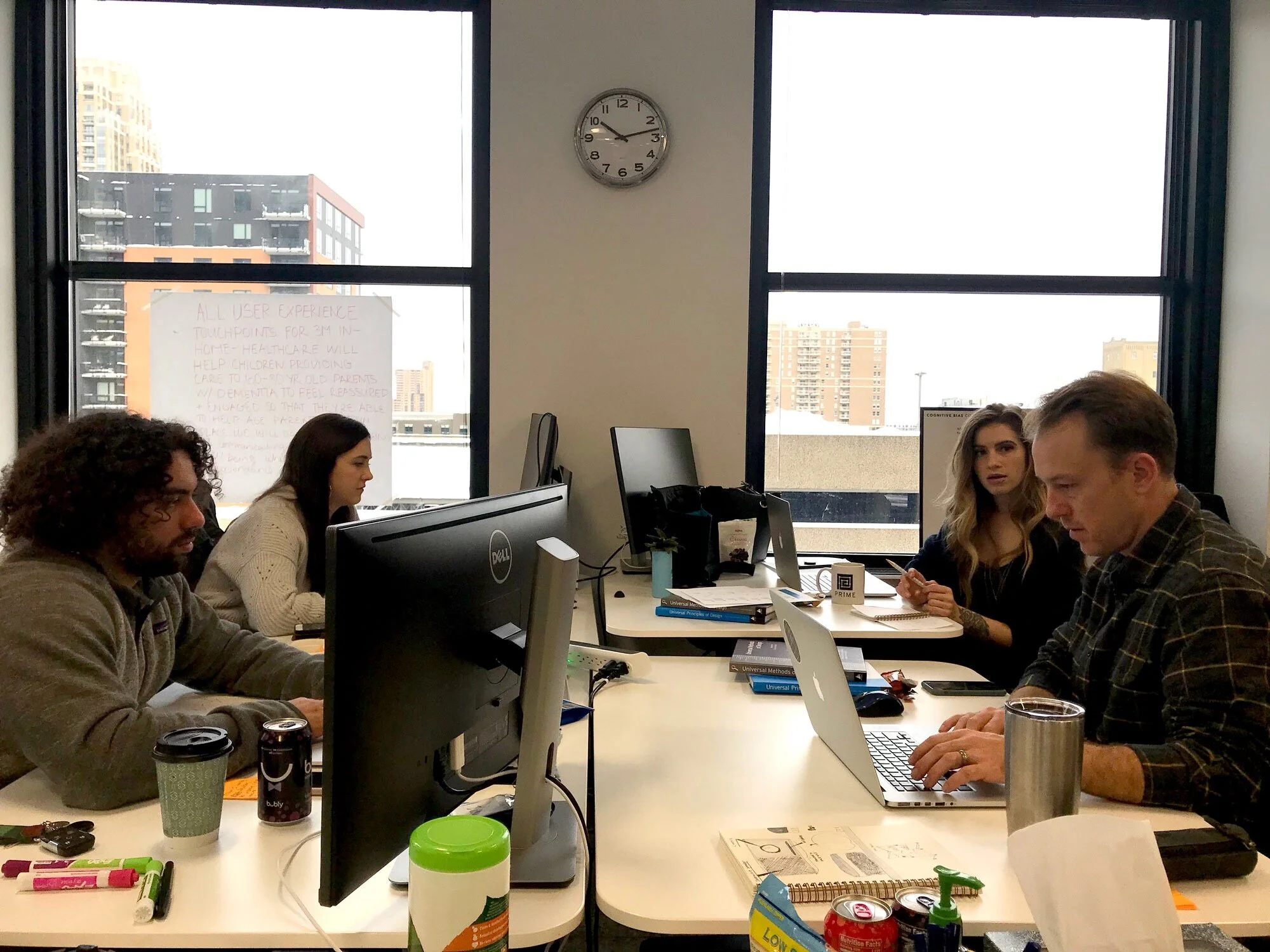
The GenEQTY team and I started with secondary research on existing financial technologies (fintech) and digital banking apps to identify strengths and weaknesses in existing products. We interviewed subject matter experts in person and remotely to learn about lending practices and gain insights into regulations and partnership models.

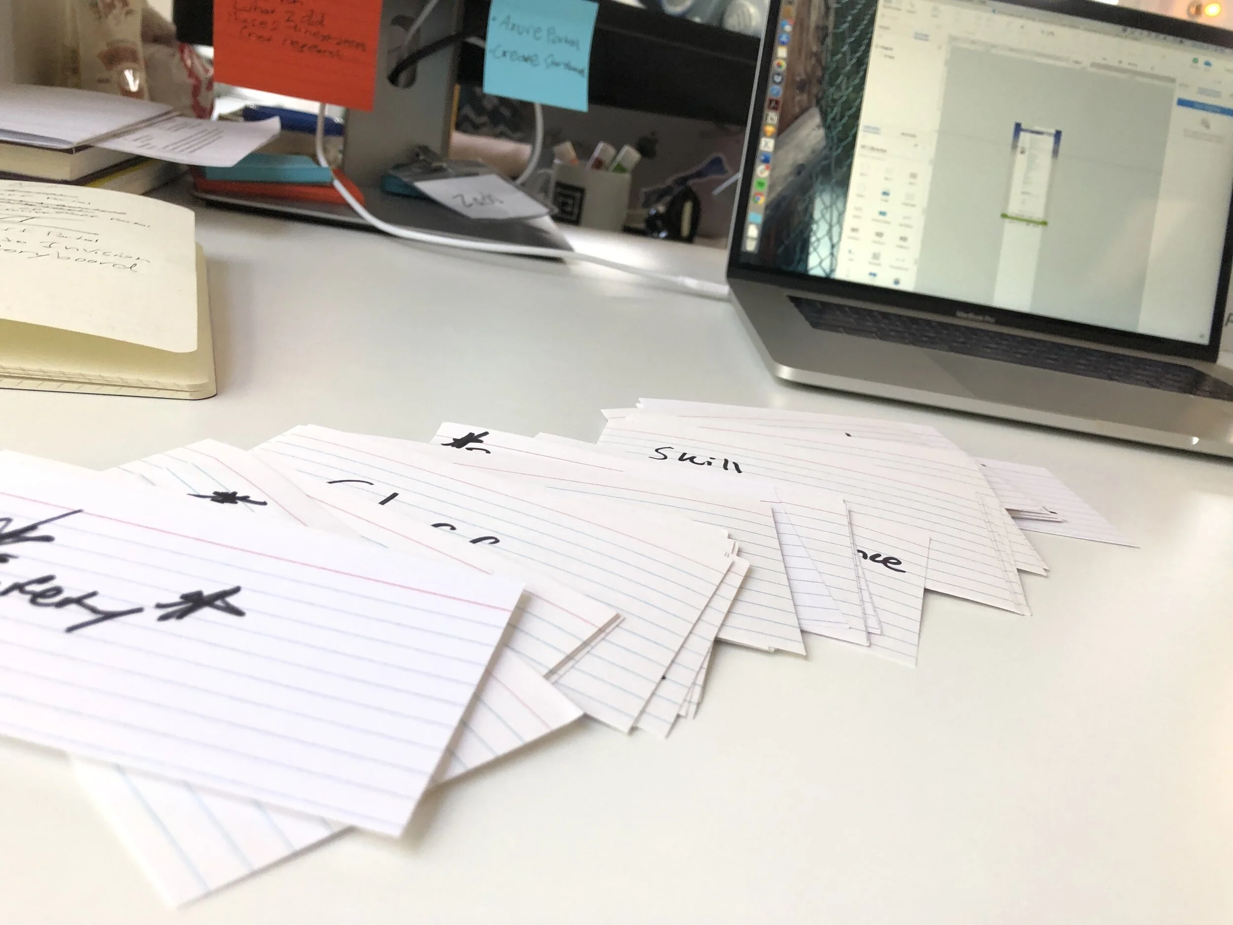
After collecting research insights, data, and synthesizing handoff documents we moved forward with an affinity diagram to help us wrap our heads around what we learned, and find common themes in our research.

We learned that users value the tone of the apps they use for credit cards and banking. They also want or want to feel like there is a real relationship being built between them and their banker.

We also assessed user feelings towards tone using mood boards

Affinity diagramming

Affinity diagramming


Prototype

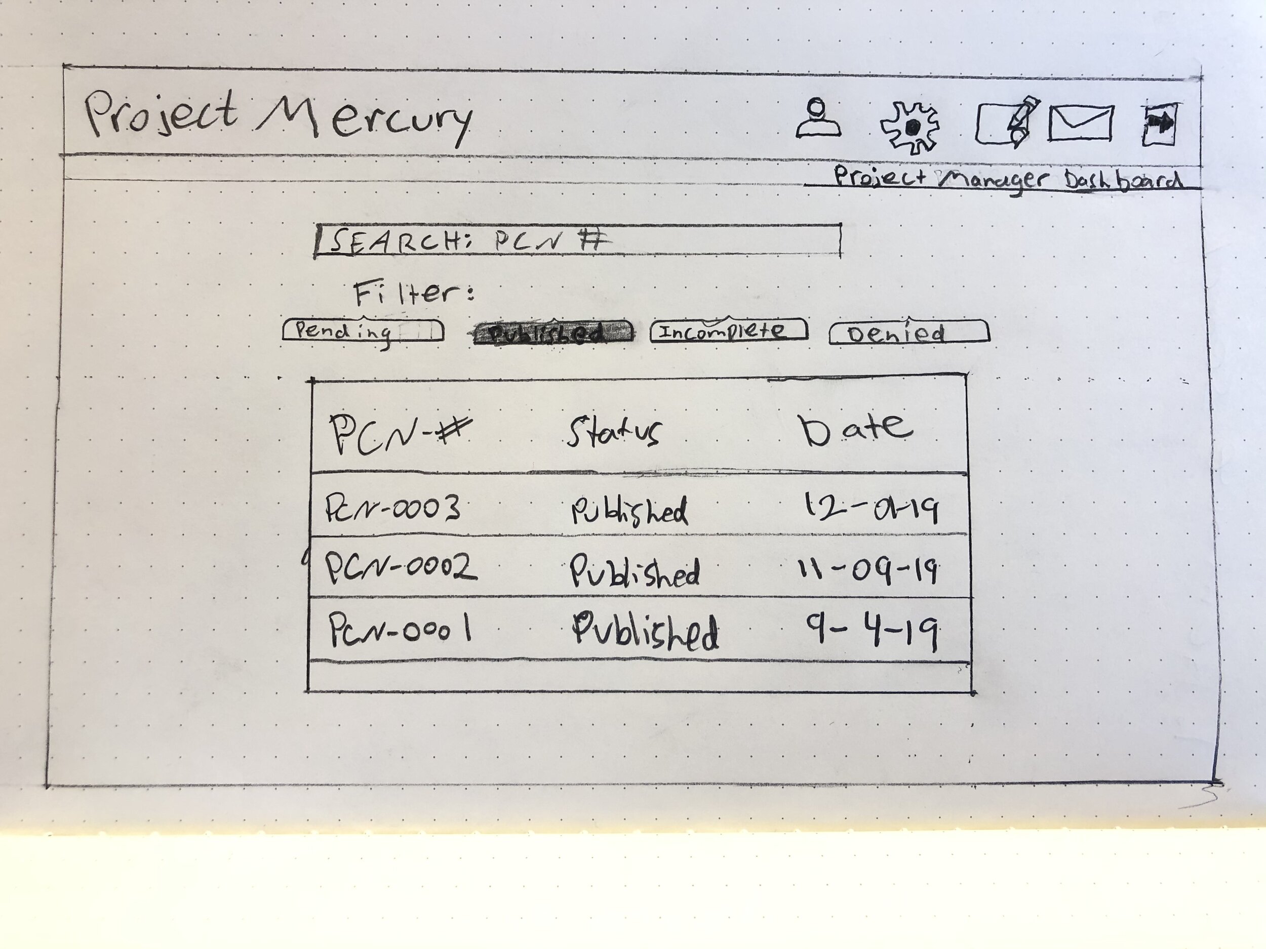
An online survey we deployed to our personal networks helped us gain additional insights into the attitudes towards business banking practices. We created Sarah, a user persona who represents the average user that we designed the GenEQTY app for.

Sarah guided us in designing content tone and user flows that demonstrate the findings from our research. We created low-fidelity app feature cards to evaluate.

 
Tone ideas created by Tyler Kimmons

Tone ideas created by Tyler Kimmons

Home, settings, and loan offer page concepts designed by I (Zach)


Evaluate

We evaluated and dot voted a select amount of features and user flows before our upcoming design critique to focus on moving forward with


Annotated wire frame of a reoccurring payment page

Annotated wire frame of a reoccurring payment page

IMG_7372.JPG
 

Phase 2: Iterative prototyping and evaluation


The goal of this phase is to design and create medium fidelity prototypes (and a few high-fidelity examples) of proposed feature for evaluation. Over the course of this phase, prototypes, content, and visual direction will be evaluated with users to determine the efficacy of our proposed app flow and clarity of features with potential users. Determine what core features would constitute an MVP as well as “stretch” features. Information architecture diagrams, Visual and content style guide, Interactive design prototype


Research

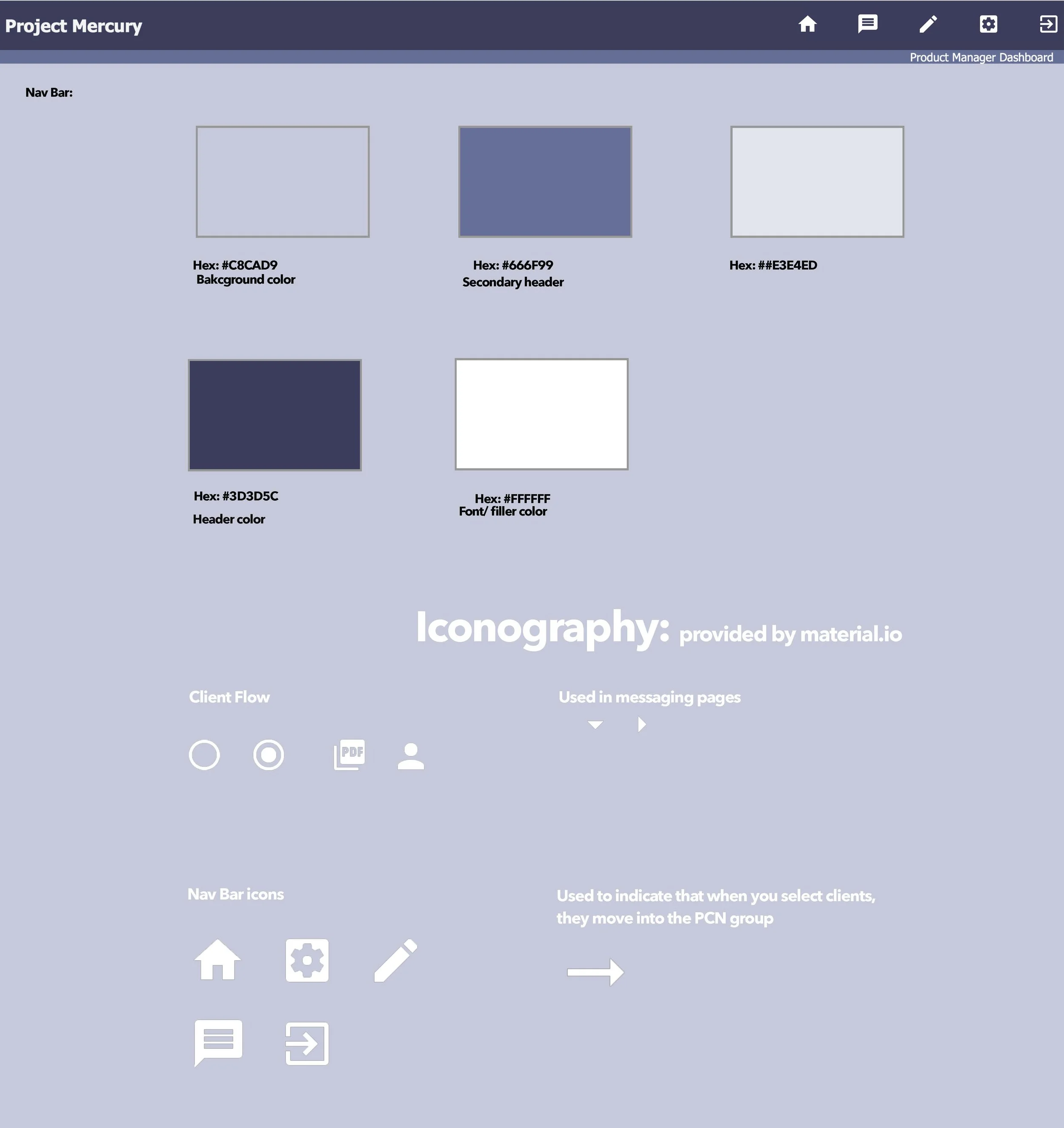
Development of content strategy guidelines. Development of visual style guidelines. Define information architecture.

IMG_7399.JPG
 

Prototype

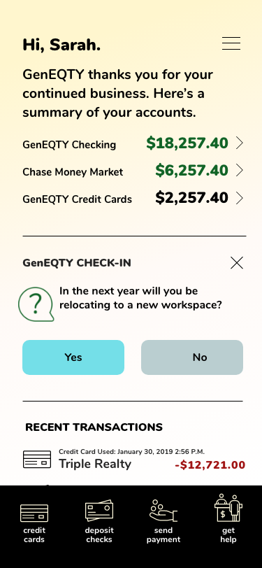
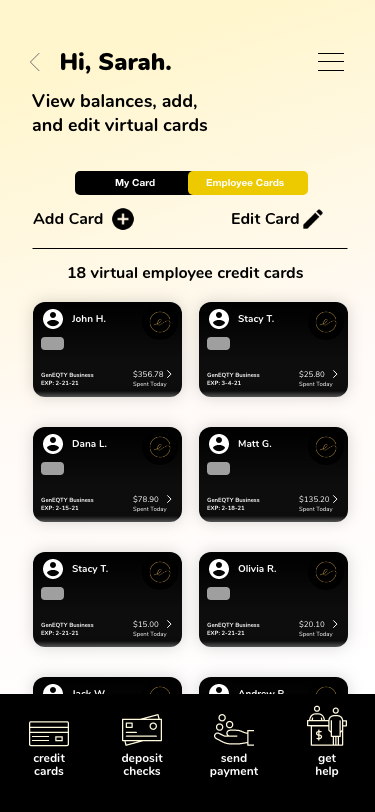
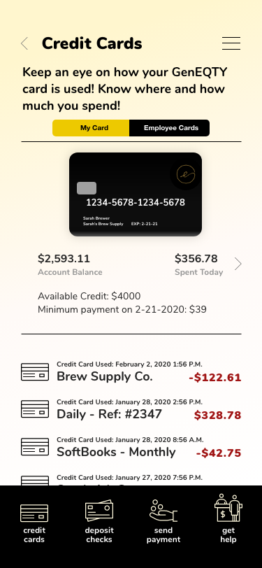
As our screens start to come together, we started seeing an app prototype being built from the ground up. I created the credit card prototypes and monthly reoccurring payments screen pictured below. Kris Kathmann, a design team member created the dashboard check in on the left


Evaluate

My team hosted a design critique with other professionals in the Minneapolis area to help evaluate our design direction, user story, and medium fidelity prototypes before the check in with our client.

Review low-fidelity prototypes and key user flows with client for accuracy. Review content and visual style concepts for feedback.

IMG_7439.JPG
 

Phase 3: Refinement and handoff documentation


Prototype

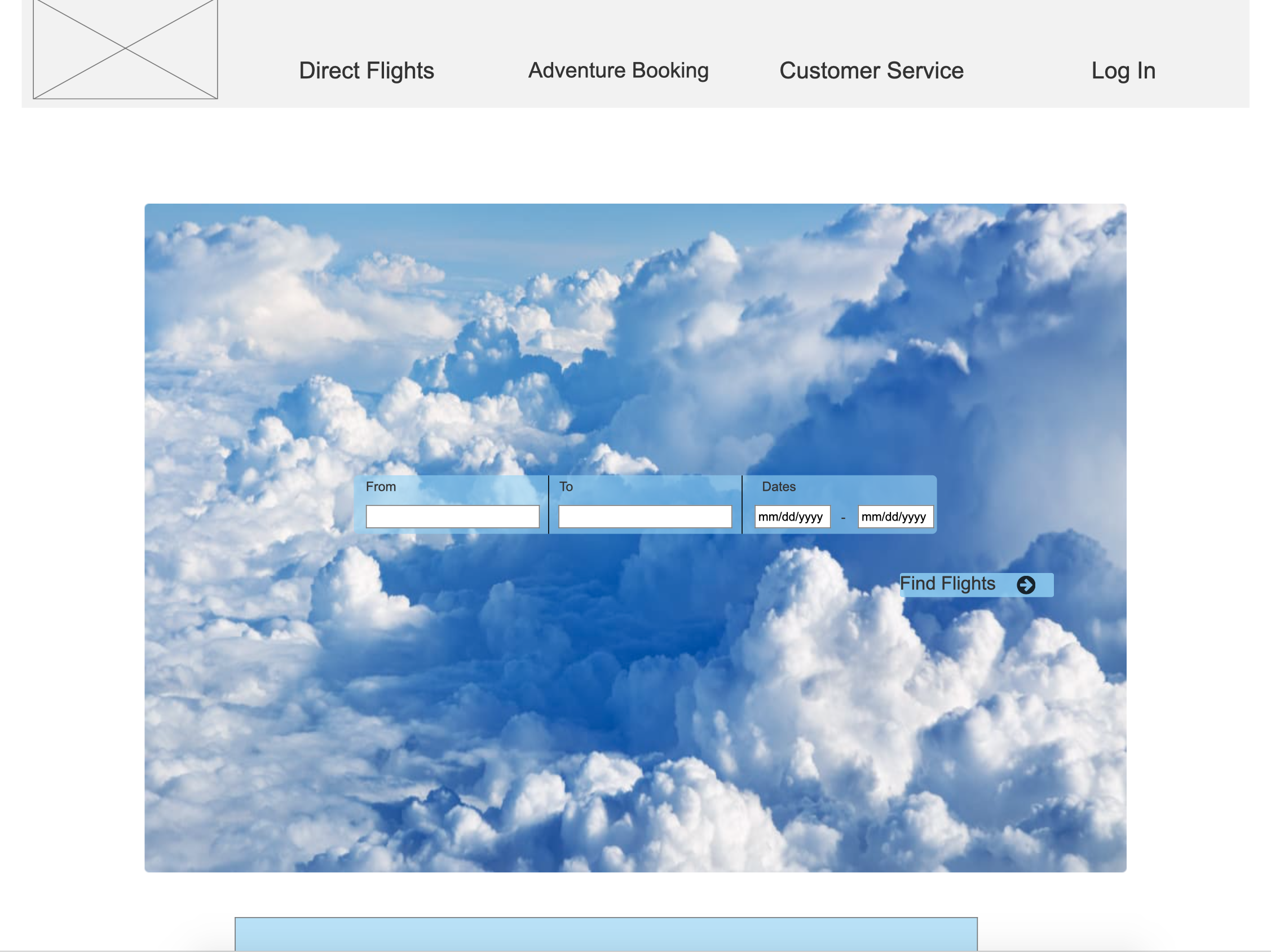
We created a marketing web page teach users what GenEQTY can do for them and their small business. The web page will help direct prospect users to download the app in the app store

Based on insights from our design critique with users, we prioritized a feature set, started adding fidelity, and created interaction within our prototype. Final interactive design prototypes will be created to demonstrate screenflows of key features with recommended content, visual look, and feel. Create and synthesize documents for handoff to client and and present project.

Implement insights gained during user evaluation and client check in to refine and raise fidelity of prototypes. Create annotated wireframes of key prototype features for client communication.

Marketing website page designed by Kris Kathmann


Evaluate

Client handoff documentation and assets package created. Creating an organized system of files I uploaded documents into files by category: a read me file with instruction of how to use the overall deliverable, and what is in each file, presentation, design assets, source files, raw research data, strategy, persona, video walkthroughs, and annotated wireframes

Screen Shot 2020-02-13 at 4.52.18 PM.png
 

Design team members:

IMG_5091.jpeg

Mobile prototypes / system design / information architecture / micro copy design / survey / inventory audit

Communication is crucial to create the best user experience for Blizzards weekly ski and snowboard trips. Enhancing the experience of RSVPing and the staff portal will create one larger cohesive service system for all users.

When members don’t respond to event RSVPs it takes an opportunity away from people on the member waiting list and confusion for management. RSVPs for members are sent via email and helps Blizzard keep members in the same groups, week to week, make sure there is enough staff, and make sure there isn’t an excess of staff.

The staff portal holds valuable information for staff regarding event dates and times, clinics to receive certifications, and helpful resources that teach staff how to be better instructors. The unordered list of a staff portal has compiled information and different pages over 5+ years. Navigating the staff portal is difficult and unconducive of its goal to help better the staff and their practice.


USERS:

  • Management- needs cohesive communication from members and staff to plan for weekly events accordingly in a small time period

  • Staff- need a portal that is navigable

  • Members- need to respond to RSVPs for best overall experience

Mail Open 3 (final)@2x.png


GOALS:

  • Increase member engagement and communication

  • Increase RSVP response

  • Increase use of staff portal


Since 1958, Blizzard Ski and Snowboard School has been providing snow-sports instruction to youth around the country. Blizzard is a “traveling ski and snowboard school”, with over 20 bus stop locations around the Twin Cities to take all their Kindergarten through 12th grade members to one of eight snow-sports destinations each week to receive professional, adult instruction from Blizzard instructors. They believe that “skiing and snowboarding are life-long activities the entire family can enjoy together”. They don’t just teach skiing and snowboarding skills, but also independence, responsibility and time management, in an age-appropriate and engaging way. 

“Blizzard provides opportunities for youth to enjoy an active, healthy Minnesota winters in a safe and fun environment. They teach independence, responsibility, and time management through skiing and snowboarding in age-appropriate groups, and connect youth from all over the Twin Cities using their moto safety, fun, and learning” - Jeff Lewin (owner of Blizzard)


Research


Parents of members receive RSVP requests via email consistently each week. Currently, the communication system receives an average 90% response rate. Sent on Sunday night at 10:00pm with a due date of Thursday 8:00pm. I dove to find how I can improve communication between members and management. When RSVPs are not responded to by members parents, Blizzard assumes the chance that they still might show up to accommodate comfort on the busses.

I initially began my research by running heuristics on the current RSVP form. Heuristics failed to prove any significant issues with the RSVP form, While the focus was the RSVP system, I was unable to find any issues with the RSVP form through contextual inquiries. I took a new approach and realized the issues surrounding no responses from members was not in the form itself, but opening the email and clicking on RSVP form link. This breakthrough paved the path towards being able to provide Blizzard with a more engaging communication system! I knew what to do following, conduct microcopy research and start focusing on what the user receiving RSVP requests really need to see, and what are they currently seeing? How do they feel when they open a Blizzard email?

 
i-zJ22N5k-X3.jpg
 
Screen Shot 2020-02-12 at 7.45.10 PM.png

After running a survey with a total of 343 responses, I discovered two key pain points for survey respondents.


76% wanted a reminder email

noun_reminder_2868168.png

60% feel Blizzard emails don’t fit their schedule

noun_Cancel calendar event_234316.png

A cognitive walkthrough of the Blizzard staff portal showed areas for improvement in the information architecture and creating subject areas for links and forms to be filled into. Staff see the value in the portal for them, but research proved that it was difficult for them to operate the page efficiently. The portal provides access for the staff to be able to reach out to their groups throughout the week reminding them to bring extra warm clothes on a cold weekend, send out progress reports, find coaching materials, and certification study guides.


Current Staff Portal


Prototype


Proposed-communication-timeline.png

Besides microcopy and body text, a brand new proposed communication timeline gives the users what they want, a more fitting email to their schedule, and reminders because members don’t always know what their weekend looks like when they receive initial RSVP requests on early in the week. RSVPs are NOW sent out on Monday nights with reminder emails on Thursday mornings, giving members until Thursday night to respond, leaving management all day Friday to plan the logistics.


The new microcopy provides greater clarity before the email is even opened. You can see where the weekend trip is, when it is, and when the RSVP is due.

Open the email, and you will find that you can add both the date of the trip and due date to your calendar by tapping the underlined dates. Previously the RSVP link was at the bottom of the email, and users turned away from the email before scrolling to find it. I brought the RSVP link higher in the email to give better clarity and proper hierarchy. At the bottom of the email is a light hearted note mentioning that every response is valuable and helps Blizzard’s logistics to overall provide a better experience for the kids.

Inbox 3 (final)@2x.png
Mail Open 3 (final)@2x.png
 
11x17@2x.png

The staff’s portal vast amounts of resourceful information had duplicates, files and links no longer applicable or valid, and was unorganized. To start the daunting process of redesigning the staff portal I started with an inventory audit in a spread sheet. The audit revealed the number of duplicate links. After having info from a card sorting activity with a Blizzard staff member, I reorganized the links into categories and pages that made most sense to the user.

prototype-staff-portal.png


Evaluate


After critiques, revisions, and editing, I was ready to deploy my prototypes!

IMG_7243.JPG
IMG_7032.JPG
 

Implementation


After implementing the new RSVP system the results where unexpected! I had a 1% decrease in member response, but a 3% increase in staff response. There are many variables involved when it comes to outdoor activities, and this specific weekend was extra chilly.

What did I learn?… sometimes all you need are small changes for large impacts

IMG_7357-X3.jpg

Cognitive walkthrough / contextual inquiries / prototyping

Screen Shot 2019-12-18 at 8.47.35 AM.png

Design, prototype, and test features to lift Project Mercury out of its MVP platform

“Documenting and communicating changes that have occurred to a mass-produced product is a key job requirement for many product managers. When a change in the fit, form, function or price of a product is introduced, a product manager issues a Product Change Notification (PCN) to their customers in order to share what changes have occurred. Today, this process happens through a variety of mechanisms (e.g., Microsoft Word template > PDF > Dropbox file shared with customers; posting change notices on a company blog), with little standardization and many opportunities for missed communication between businesses and customers. Project Mercury is an MVP platform to address these key challenges with documenting and communicating changes to products, including new product introductions (NPIs), end-of-life announcement (EOLs) and all other product change notifications (PCNs)” -Andy R, Stakeholder. What happens when a product change isn’t communicated well? Production lines go down, end consumers become upset, hours or days are waisted on the phone between manufacturers and distributors. Manufacturers are missing vital opportunities to create genuine cohesion between production lines and end consumers. PCNs are issued by manufacturers to inform customers about a change to a mass-produced product or its manufacturing process. A New Product Introduction (NPI) encompasses all the activities within an organization to define, develop and launch a new or improved product. "End-of-life" (EOL) is a term used with respect to a product supplied to customers, indicating a product is in the end of its useful life (from the manufacturers point of view). It is meant to standardize the creation process and streamline the distribution of that information to those who need to know it. Project Mercury is a web application that facilitates the creation and tracking of PCNs. The overall goal of Project Mercury is to streamline and standardize the PCN creation process, while providing a user-friendly experience for locating and viewing the PCNs.


Users

  • Product Managers needing to communicate product changes to customers efficiently

  • Individuals looking for updates on the products they are using or selling

Goals

  • Receive email updates when products are included in a PCN. If a product is changed, each product owner using that product will be notified via email

  • Product details page with timeline showing history of changes. Once a user has decided to navigate to the product details page, they would be able to view every PCN, EOL, and NPI that include said product

Methods:

  • Cognitive walkthrough

  • Contextual inquiry

  • Prototype


Research/Evaluate


Cognitive Walkthrough

Project Manager Dashboard sketched wireframe

Project Manager Dashboard sketched wireframe

Andy provided me the key tasks a Product Manager can perform:

  • Create a PCN/NPI/ or EOL

  • Edit a PCN

  • View a PCN

  • Search for a PCN

Remote and on site cognitive walkthroughs revealed natural patterns of communicating change among companies and organizations both internal and external. The focus of the cognitive walkthrough is to understand our user’s and system's learnability for new or infrequent users. You can download the deck featuring lightly annotated visuals matching the data sheet below.


Testing


I created a system for users to be notified about their PCNs and an easy way for Project Managers to communicate that change. Project managers will have a list of “customers” as represented below to select customers who use the product that PCN is for. Once the PCN is approved by the admin, an email notification will be sent out to the PCN group with a PDF file of the PCN form. Clients can respond to that notification via a contact form. A customer service representative will receive the response and respond accordingly. Feel free to take the Invision tour!


Updated dashboard with search bar, updated iconography, and simpler PCN form

Updated dashboard with search bar, updated iconography, and simpler PCN form

Customer list and PCN group

Customer list and PCN group

Project Mercury keeps the end user off the platform as much as possible while communicating vital and important information for them about changes in products
— Andy R, Founder
Clients email notification and response opportunity

Clients email notification and response opportunity

Customer service representative notification and response to client

Customer service representative notification and response to client


Research Recommendations


Contextual Inquiry

Remote contextual inquiry with founder Andy Reiter

Remote contextual inquiry with founder Andy Reiter

Product Change Notices (PCN’s) are used among a magnitude of industries to communicate changes in product from manufacturer to end user with a distributor as the middle man. Project Mercury wants to become a key influencer in the space of PCN’s. They’re goal is to formalize the process of PCN’s so the end manufacturers are fully informed of all product changes that distributors may not convey. Currently, there is no one standardized way to communicate changes in products efficiently and consistently from manufacturer to manufacturer. This is what Project Mercury is set out to do. With average five per week roughly 260 PCN’s/ year, there is a lot of communication to be had that currently isn’t being held

End of Life (EOL’s) notices help the end users save money allowing them time to find new manufacturers for the parts they need. If an end user doesn’t find a new manufacturer or doesn’t want to, their end product will be discontinued. Manufacturers communicate product changes (PCN), new product introduction (NPI PCN), and end of life (EOL PCN) to distributers who are responsible for communicating these PCN’s to the end user. These notices are essential to the end user. When these EOLs are inaccurate, miscommunicated or worst of all not communicated it puts strain on all parties involved all the way down to the final consumer.

One of the largest issues perceived in this space is delivering PCN’s to the end user. There is no accountability system for distributors to hand off PCN’s from manufacturers to the end user. Emails and informal documents have been proved by research to be sufficient for small operations, however Project Mercury is hoping to achieve a larger goal.

Its tedious work to create a PCN/NPI/EOL and due to the informal process, is very easy to make mistakes, miss important information, and make sure it gets to everyone who needs it. They are often handed from person to person in hopes that’s they make their way down the chain to the end user. What happens when the end user doesn’t get any PCN’s? The end users spend hours wasted on the phone talking to distributers who need to talk to manufacturers to get simple answers such as “why is this part going out of production? Where will I get these parts now? How long do I have to purchase these parts still?”. Some tools currently used to communicate PCN’s are email, Dropbox and Microsoft Word.


Site style guidelines


Colors and icons

Colors and icons

Symbols

Symbols

IMG_6923 2.JPG

Script writing / usability testing / remote & in-lab sessions / data synthesis

Observing a usability test and taking Trello notes with team members

Observing a usability test and taking Trello notes with team members

Usability testing for SkillSense revealed opportunities to connect early career practitioners with mentors and experienced professionals.

Launching a career in a new industry presents many challenges, including making meaningful connections with more established professionals and finding project work to keep advancing your skills. SkillSense is a networking and freelancing platform that addresses both of these problem spaces. SkillSense is driven by the ability to connect early-career individuals (e.g., students, recent grads, career switchers) with those more established in the industry who are looking to serve as mentors. These less-experienced, but connected professionals are able to leverage the platform to find project work from clients with tight budgets (e.g., startups, nonprofits) and/or small project scopes (e.g., MVP prototypes). When engaging on a project, they benefit from the guidance of a mentor, visible to the client. Clients benefit from a competitive rate and the supervised nature of the engagement. As SkillSense prepares for launch, they are especially looking to ensure that clients are aware of the value of hiring ‘mentored’ or supervised talent. Clients should be aware that the early-career professionals they are hiring have the support of a more established career professional, in order to increase their confidence in the work product as well as the platform as a whole.


Users

  • Clients looking to hire freelancers to complete small-scale projects

  • Early-career individuals looking to acquire project work and advance their skills

  • Established professionals wanting to give back to their communities

Site Goals

  • Facilitate networking between early-career individuals and established professionals

  • Easily connect those looking for work with those wanting to take on a new project

Test Goal

  • Evaluate how well site connects students with mentors and clients, and communicates credibility of users. Identify users pain points surrounding usability. Identify opportunities to strengthen communication of sites value.


Evaluation


Heuristic Analysis

After settling into our understanding of the user goals, my design team and I used the Nielsen Norman Group’s 10 Heuristics for User Interface Design using a severity scale of 1-3. Each team member took on a different user role. Mine was the student role where I tested these tasks:

  • Create/edit a profile

  • Search for a mentor

  • Request a mentor

  • Send/view messages to mentor

  • Search for jobs

  • Apply for a job

  • Invite mentor to a job

 
Heuristic analysis results

Heuristic analysis results


My teams white board with our weekly scope


After running heuristics, we came up with our testing goals.

  • Identify user pain points surrounding ease of use

  • How well does Skill Sense communicate credibility of site and users?

I see the intention and its intriguing
— Client Participant
 

Research


Usability tests:

In-lab and remote usability testing were conducted to get directly to the trouble points of Skill Sense’s website. I learned so much during my first usability test. My design team and I constructed an evaluation script with one to three scenarios to walk through per role. Framing scenarios in a way that doesn’t lead the user in any specific direction was a difficult task. Further, asking those questions to the users and watching them become frustrated or upset over functions not being available is hard to watch and even harder not to intervene and help correct or lead them.

Observing usability test behind a one way window, monitoring the users screen through an HDMI output.

Observing usability test behind a one way window, monitoring the users screen through an HDMI output.

Remote testing:


Capturing feelings and emotions through digital platforms is a difficult task. Remote testing samples were gathered from personal connections. In remote sessions I had three users who fit the roles of actual users of SkillSense, a client user who owns an IT company, a practitioner in the tech space who has mentored in the past, and a user who is a recent graduate with a degree in computer science looking for work.

Google Hangouts and Quicktime screen recordings along with consent forms created a uniform ecosystem of platforms to conduct remote testing. How i recruited? what i learned (challenge, different next time)

Google Hangouts logo

Google Hangouts logo

Quicktime logo

Quicktime logo


In-lab:

IMG_6800.JPG

In-lab testing was conducted at Fathom Consulting in Downtown, Minneapolis. Our findings were able to help Skill Sense grow and see new insights by getting direct feedback from our users. In lab had similar intentions as the remote, but being able to see the emotion in users was invaluable. Per user evaluation there was a note taker in the evaluation room with the moderator and user. Behind the one way window there were observers following the actions from the user by watching a mirrored screen display and taking live notes on our Trello board.

A communal Trello board for the design team used to document notes live during usability evaluations. Labeled by themes created before the evaluations


Findings


Key findings/ usability pain points(include images)

Users showed confusion after logging in and landing on their profile page. Many comments suggested to have seen a home feed of sorts rather than your profile dashboard and felt confused after login.

Screenshot of a mentor’s profile

Screenshot of a mentor’s profile


Prototypes


skillsense-wireframe.png


IMG_6800.JPG

ecare / ageism / family structure / social gerontology

Conceptualize an ecosystem of devices to help people age in home longer using existing 3M product.

It’s hard to feel comfortable with letting your parents live at home as their age comes with declining health concerns. From physical to cognitive health declines, these challenges are facing us all. Our stakeholders came requesting we conceptualize a group of interconnected devices that will allow aging people to age in home longer. The devices will help children of parents with declining health feel comfortable to live at home by themselves. No parents want to leave home before they feel ready, with 3Ms smart ecosystem of devices, you will be able to monitor your loved ones without having them feel monitored. In fact, it’s an engaging system that will help them with daily tasks to live at home safely and responsibly while keeping you in the loop.


After meeting with our stakeholders from 3M we had to ask ourselves

What are the goals?

  • Create an ecosystem of IoT devices that help people age in home longer and provide family comfort in knowing their family members are safe

Who are the users?

  • 60-80 year old people with declining health

  • Children 40-60 years old who take place as caregivers

 
Communications Map made by team member Andrew Hall

Communications Map made by team member Andrew Hall


Methods:

  • Stakeholder Interview

  • Research and debrief with team

  • Create a strategy statement

  • Experience Map

  • System of IoT prototypes

  • Multi-touchpoint experience walkthrough

 
Home-based sensor and diagnostic technologies could help establish “disease signatures” that show up physiologically and behaviorally before more severe symptoms become readily apparent. typical sleep patterns, eating habits, body temperature, and blood pressure
— Dreshner, 2010
3 out of 4 adults ages 50 and older want to stay in their homes and communities as they age—yet many don’t see that happening for them
— AARP
 

Research


This raises massive concern for many reasons. The United States doesn’t have infrastructure in place to support this magnitude of people. With the number of aging people on the rise, we have to consider how these people will be cared for. Research shows that minor hospital visits can lead to longer term health concerns and ambulance services are flooded from minor emergencies preventable by emerging technologies.

I dove to find 3M products that we could use from plastics, glass, temperature readers to foams and sensors. Using those products to conceptualize a device that would help aging people remember to go on walks and communicate with other devices in it’s ecosystem cohesively creating a safer environment for people to age in home longer.

Where the gaps are and how can we close them?

We dove deep and conducted secondary research on how people are aging in home and whats stopping them from successfully doing so. We found the gaps in the system and conceptualized our ways to make those gaps smaller. We know it can be difficult to get a parent using tech to its fuller capabilities, so our concepts had to be creative in a way so that aging people wont run into frustrations using them.

Journey map of current health care experience. Made my team member Andrew Hall

Journey map of current health care experience. Made my team member Andrew Hall

Where are the opportunities?

I found that some of the key problems in this space are created by feelings of loneliness and fear of losing independence. Multigenerational homes are a thing of the 20th century and those feelings of having grandparents living with their children are still profoundly held feelings to them because they’ve experienced it themselves. These feelings manifest into larger themes like lack of communication with family and grandchildren, not enough time to help, living alone and an overall lack of help. There are technologies and systems currently working to close these gaps such as pill dispensers, delivery systems, analytic systems that keep doctors informed on patient health without needing to see the patient, and aging friendly smart devices. Our map bridges the gap between hospital caregiving and the home. The map pulls together many facets of the healthcare for the stages of life between the strong ability to live alone verse needing help on a day to day basis. We are keeping families informed and assured that their loved ones are keeping on track with day to day necessities such as moving, eating and security.


Strategy


”All user experience touch points for 3M In-Home Healthcare will help caregivers providing care to 60-80 year old aging individuals with early signs of dementia and/or general declining health to feel reassured & engaged so that they are able to help these aging individuals age-in-place. We will do this by focusing on communication & reinforcing well being while maintaining independence.”

Several studies have found that nursing home residents have worse health outcomes than seniors who choose to age in place, even if seniors are in similar health. Our system is aimed to be preventative. Our devices use existing 3M tech: data and analytical science, electronic systems, software solutions, connected systems, healthcare data management and other products such as high density foams and temperature sensors. We want to create an experience where our elders can be monitored without feeling monitored.

Team’s strategy statement written out and posted up through duration of project


Prototyping


Introducing Seat Buddy:

Seat buddy is an interconnected device that communicates with the other devices in the 3M health care ecosystem. When seat buddy’s haptics activate, you’ll also find a corresponding message on the smart frame interface with phrases such as “it looks like you’ve been sitting for a while, lets take a walk”, “looks like its time to eat!”, “have you had your meds today?” Seat buddy is made using 3M’s temperature sensors, open cell polyurethane foam and closed cell high density foam.

Seat Buddy interacts with the other devices in our ecosystem. When someone interacts with Smart Entry, you will be notified who is at the front door with haptic feedback from your Seat Buddy along with being able to see who is at the door from your chair with the corresponding Smart Frame. Seat Buddy communicates with the Smart Fridge by using haptics with corresponding messages from Smart Frame about when you should have a meal or a glass of water. Seat Buddy also lets you now when you’ve been sitting for a while to encourage you to get up or move around. Hoping that moving around will prevent hotspots following with open sores and infection. Our SmartCare Sensor is the joining hub of our ecosystem.

3 layers = 4” thick

  1. Upper- open cell foam for breathability and comfort

  2. Center- wiring for haptic feedback and temperature sensors

  3. Bottom- super dense foam for stability

Screen Shot 2019-11-27 at 3.34.58 PM.png
seatbuddy-prototype.png
 

Other prototypes in our ecosystem

Smart Entry developed by team member Amanda Gunderson

Smart Entry developed by team member Amanda Gunderson

SmartCare Sensor developed by team member Kaitlyn Reinhart

SmartCare Sensor developed by team member Kaitlyn Reinhart

Smart Refrigerator developed by team member Andrew Hall

Smart Refrigerator developed by team member Andrew Hall


Implementation Recommendations


storyboard_EK_linear.jpg

We’ve made tactics and implemented the ideas, we’ve created the design principles and experience strategy. In the future, We would work with businesses to create a strategy that is feasible and attainable to achieve our North Star goal. We would like to gamify some aspects of our system that is geared towards patients with declining cognitive health. I believe our in home Smart Frame could include interactive memory activities to help patients remember loved ones and family members. This application would help patients remember they have family letting them remember they are not alone, as well as being able to remember who the faces they might see on a day to day or weekly basis.

Implementation map

Implementation map


Are you or a loved one living with dementia? Do you have stories to share?

I invite you to add your voice to the conversation.

IMG_6877.jpeg

Journey map / rapid prototyping / kano survey / annotated wireframes / interactive prototypes

Runerra_Logo-1024x1024.png

Looking For a Favor?

“Runerra is a community run app that connects those already at the store with people nearby who need something. Individuals can share their location or errand with others in their communities in order to digitize the “I’m at the store, do you need anything?” conversation. Those who need groceries or other items can request them and avoid delivery fees by jumping on an existing run. Runerra’s vision is to challenge the traditional delivery model while encouraging individuals to form new friendships, strengthening connections within communities, and empowering local business to connect with new and loyal patrons.”

-Stakeholder

Users:

  • Runners: Looking to help out a friend/neighbor by picking up items for them while they do their own errands.

  • Buyers: Looking to get groceries, food, etc. picked up for them at an affordable cost

Goals:

  • Match user expectations by demonstrating support for users needs

  • Create features for the app that resonate


Research


Runerra buyer (requesting a favor) journey map


Journey Map

Runerra’s app is a simple and great idea, but they have issues retaining users in particular due to clarity of their site. The buyers goals are to find a shared run which they can request a favor. A journey map is a visualization of the process a person goes through in order to accomplish their goal. In its most basic form, journey mapping starts by compiling a series of user actions into a timeline depicted by the solid line (current state) and dotted line (future state based on recommendations). In this case, Sarah is the user and her experience using Runerra is mapped out with her emotions and actions throughout the her experience. The timeline is fleshed out with user thoughts and emotions in order to create a narrative.

After playing with the app and creating some user experiences, the stakeholders came in for a formal stakeholder meeting. Ashley, the developer and Sam, the founder of Runerra sat down and spoke to what they have seen as Runerra’s blockades to becoming a cheaper option to grub hub or retail delivery. Their research showed Runerra’s communities worked best in micro-communities with larger friend groups who know each other to at least some extent, “We want to get people who don’t want to meet… to meet” a startling statement by the founder. He isn’t far off, with some interface and verbiage change Runerra just might make people don’t want to meet…. meet!


Kano Analysis

Kano analysis is a quality measurement tool used to determine which functions are important. All identified functions may not be of equal importance to all users. Kano analysis helps rank functions for different users to determine which have the most value to their experience. The Kano analysis are the synthesized findings from a Kano survey sent out to professionals in the field. The survey contained ten dominating rapid prototypes through a dot vote by 15 UX designers from a selection of 40 prototypes. The survey prompted users with two questions “how do you feel when this function is present? How do you feel when this function is absent?”. The data displayed the value users held towards the functions they were presented. Our functions fit into the realm of high satisfaction and expected functions with outliers landing in “surprising/delighted”.

1_Grocery Shopping.jpg


Prototyping


Rapid Prototyping

The Kano analysis proved syncing contacts at onboarding will give new users the opportunity to see if any of their friends use the app. The more contacts they have using the app, the more trust, credibility, and comfort it will give new users.

Favorites and recents with a map view proved to be a highly satisfying and performance function.

Favorite and recents with map view rapid prototype

Payment instructions rapid prototype


Sync contacts rapid prototype


Interactive Prototypes

Prototypes built in Axure allowed me to deliver an interactive prototype to the client and let me test the interactivity of screens in the app. The Kano analysis gave me direction as to what features resonate with my users. Understanding the interactivity will help me strengthen the features that resonate most with users. To get a better idea, download the PDF below.

Recents and favorites with map view

Notification settings final


Implementation


Since the work I have completed for Runerra, they have gone under a complete redesign and relaunched the app as Pikup including the new features such as map view and notification settings. Runerra’s vision is large, and with the help of UX Research and Design they will be able to create a community of users who help each other complete daily tasks.


IMG_6995.jpg

User goal:

User is an efficient and smart traveler looking for an airline with efficient customer service and better search

preferences for more direct flights based on these personas

 
Screen Shot 2019-11-07 at 3.40.34 PM.png

Directed Story Telling

To start, I turned to a qualitative research method to discover how people felt purchasing flights through commercial airlines. I started with three directed story-telling interviews. I prompted the interviewees with: “Tell me about a time you booked a flight through a commercial airline”.

Goals:

The goals of my research are to create a website that will better fit the needs of my personas. My personas help me create an overall happy-medium to what the larger population of users will need.


Wireframing

Screen Shot 2019-11-07 at 7.54.05 PM.png

My wire frames achieved specific multiple user goal requirements. My adventures page give ease to users for finding new adventurous destinations based on their interests and for reasons they desire to travel for. The customer services page gives users immediate assistance with a 24/7 chat window. Phone numbers for customer service are placed with good hierarchy because in an advancing tech world, sometimes the easiest solutions are found with real connections talking with someone. My booking page has specific search preferences that will address issues of baggage size and weights in both imperial and metric measurements and includes connecting airport preferences.

Screen Shot 2019-11-07 at 7.52.27 PM.png

Screen Flows

The next step in research is to construct organization through screen flows of airline.com to clearly show where pages will lead and how they are connected.


Usability Testing

Usability testing gives me insight on a users first time accessing the website. It can be considered as a blind test. We take users, get consent to record them and prompt them to perform a specific task and take note on their performance. The goal of usability testing is not to see how smart my users are, but is my site being used the way it was intended to.

Homepage Screening

We start with the homepage to get an idea of the users mental model with the website. What can they expect from the homepage? How are they going to start their task from here? Are they utilizing the navigation bar? Does it meet their needs? Does my design communicate well with the user or are they getting frusterated with it?

Screen Shot 2019-11-08 at 12.00.11 PM.png

Select Outbound: Step One

We followed the homepage screening by asking the user to book a flight. Users liked seeing weight of bags in both metric and empirical measurements to accommodate international travel. Our progress bar gave feedback to users about what step in the process they are in.

Select Return: Step Two

Main goal for selecting returning flights was for the user to understand they were selecting a return flight. I realized users ended up becoming lost with our feedback bar (a feature to be fixed in updated prototypes).

Payment Processing: Step Three

To the left you can confirm your selected flights, following to the credit card info and other necessary information. By this point in the process, the user should be logged into their account profile and can select seating arrangements in the customer service tab.

Screen+Shot+2019-11-08+at+12.01.10+PM.jpg

Results:

The users were able to book flights at relative ease. Through testing I discovered many gaps in the process which will be fixed in the updated prototype.

Successes:

  • User enjoyed using “Adventures” page to find relevant new destinations

  • Customer service page was a strong asset to this website with easily accessible resources such as chat windows and good question categories

Confusions:

  • User was lost at return flights page when they used “Direct Flights” tab to start their search vs. using the homepage to start

  • User was unable to adjust destination in “Direct Flights”

  • Seat selection should be more easily accessible

  • Header of homepage should be placed with better hierarchy so the user understands why they would want to use Airline.com

  • Hierarchy of log in screen could be placed more obviously